Poly9 AI · Trends · US home retail

US home retail 2026, from the sources

Five trend bodies published a 2026 direction for home: a white, a teal, an earth palette with digital accents, three style worlds and a khaki. This page cites each one. Then it reads them for what a maker of metal, wood or textiles can change in a collection before the October markets.

Published 18 September 2026 · Sources checked the same day

The published 2026 direction for US home is warm, quiet and tactile. Pantone chose a white (Cloud Dancer). WGSN and Coloro chose a dark teal "paired with walnut, brass and clay". Heimtextil set a palette of sand, clay, soot, olive and bark with acid-green and lilac accents. Ambiente split the year into brave, light and solid. For a maker, that means one warm neutral finish family, one dark accent (teal, soot, matte black) and one visible craft detail per collection.

Colour: what was published

Four colour calls for 2026, each with its source. Read them together and the palette is a warm neutral base with one deliberate dark accent.

Pantone Color of the Year 2026 · source

Cloud Dancer, a white

Our reading: A calm, chalky white. For makers: white-washed oak, powder-coated white metal, undyed cotton and linen. Show it next to a dark accent so it reads as a choice, not an absence.

WGSN and Coloro Colour of the Year 2026 · source

The WGSN and Coloro teal

Our reading: A dark blue-green (the official name is on the source page). WGSN pairs it with walnut, brass and clay for home. That is a ready-made finish story for metal and wood lines: brass hardware on a teal-lacquered cabinet, teal velvet on a walnut frame.

Heimtextil Trends 26/27 palette · source

Sand, clay, soot, olive, bark

Our reading: An earth base with acid green, digital lilac and screen blue as small accents. For textiles: the base colourways of a duvet or cushion range, with one accent colourway per story.

Sherwin-Williams Color of the Year 2026 · source

Universal Khaki

Our reading: A warm mid-tone neutral for walls. Anything you place against it (brass, walnut, terracotta, teal) reads warmer. Use it as the wall colour in your vignettes so buyers see the piece in the room they will sell it into.

Material and form: what was published

Two fair trend programmes describe the shapes and surfaces. The overlap is craft you can see.

Heimtextil Trends 26/27: "Craft is a verb"

Six themes, curated with the Milan platform Alcova. The ones a home maker can act on: Source.

  • Crafted irregularity. Visible knots, uneven dye, asymmetric finishes as a deliberate counterpoint to machine perfection. Hand-hammered brass and slub-weave cushions sit here.
  • Sensing nature. Natural forms decoded into pattern. Leaf and bark structures on jacquards, organic silhouettes in metal.
  • A playful touch. Ruffles, tassels and neon accents as small interruptions in an otherwise quiet piece.
  • Visible co-work. Digital design finished by hand. A generated pattern, hand-embroidered.

Ambiente Trends 26+: brave, light and solid

Three style worlds from Stilbüro bora.herke.palmisano, shown at Ambiente in February 2026: Source.

  • Brave. Raw materials and bold contrast. Blackened iron, rough-cast brass, saturated colour.
  • Light. Soft colour and visual levity. White-washed wood, sheer textiles, pale ceramics.
  • Solid. Tactile comfort and rich texture. Chunky weaves, oiled walnut, stone.

How we read it for your line

This section is our reading, not a published finding. It is what we would change in a collection this month if we made these products.

Metal décor

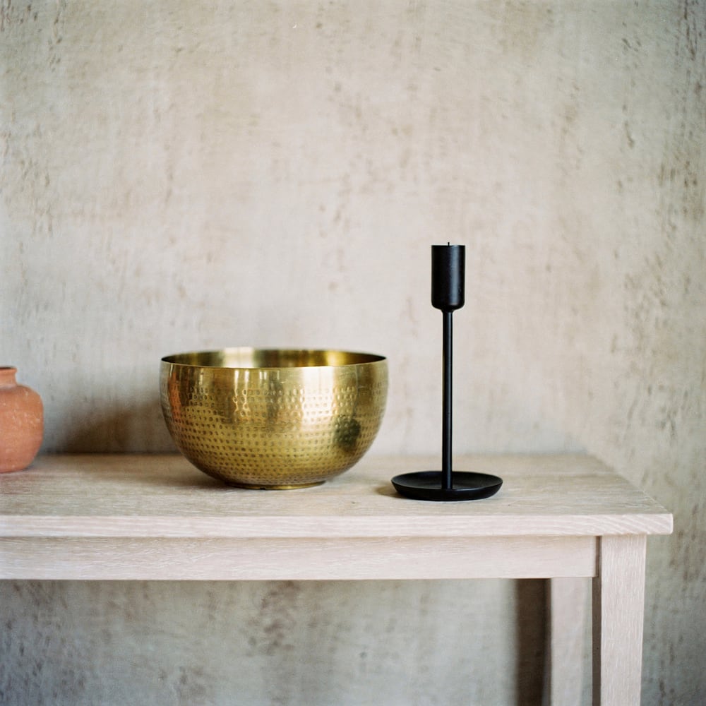
  • Offer one dark finish beside brass, soot-black powder coat or a teal lacquer, so both the "brave" and the "light" buyer find a piece
  • Keep hand-hammered and rough-cast textures visible in the hero shots; that is the "crafted irregularity" theme in your material
  • Shoot vignettes on a khaki or sand wall, not white, so the brass reads warm
IHGF 2026 reading for metal, wood and gifts

Wood furniture

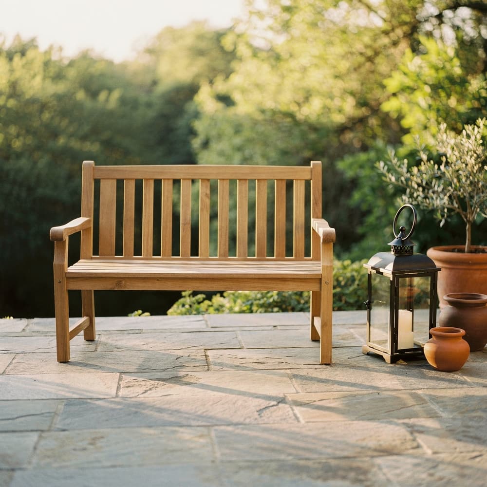
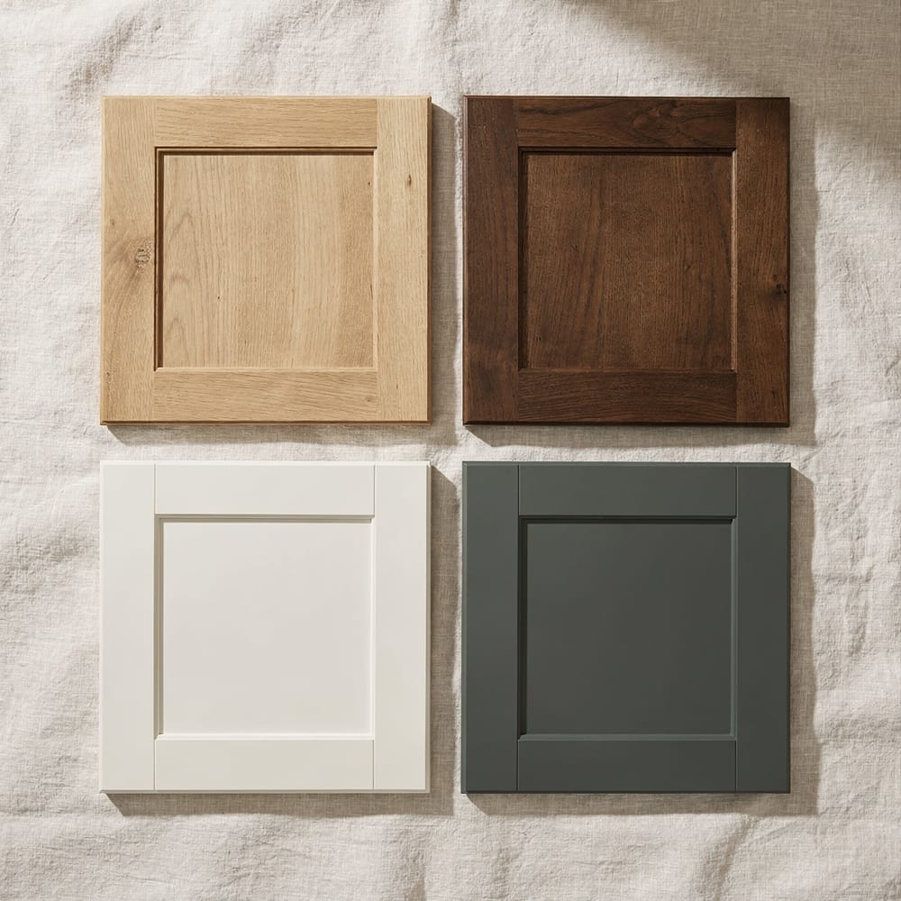
  • Run two finishes in one silhouette: white-washed or natural oak (light) and oiled walnut (solid)
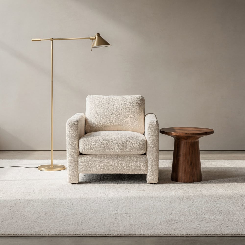
  • Pair walnut with brass hardware and a teal or clay upholstery colourway; that is the WGSN pairing, ready to quote
  • Print the finish grid on the second screen of every collection so the two-finish story is visible before the price
Furniture and lighting on Poly9 AI

Home textiles and fabrics

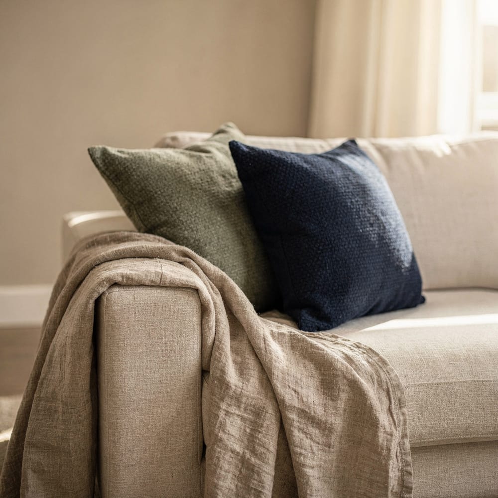
  • Build the base range on sand, clay, olive and soot, with one accent colourway per story (acid green or lilac in small pieces)
  • Keep one slub or hand-finished quality in every range; buyers reading Heimtextil will look for it
  • Load the size-by-colourway matrix before the buyer asks "king, three colourways, lead time"
Textiles on Poly9 AI

The dates that matter

Organiser dates only. Plan the collection three weeks before the first one you attend.

FairDatesWhereSource
IHGF Delhi Fair, 62nd edition13 to 17 October 2026India Expo Centre & Mart, Greater Noidaorganiser
High Point Market, Fall17 to 21 October 2026High Point, North Carolinaorganiser
Heimtextil12 to 15 January 2027Frankfurtorganiser
Ambiente29 January to 2 February 2027Frankfurtorganiser

The Monday-morning list

  • Pick one story from the reading above and name it the way a buyer would search for it
  • Choose 8 to 15 products that carry it and one dark accent finish to add to the grid
  • Shoot or render two vignettes on a warm neutral wall, labelled with the product names
  • Write the first pricing rule for the new finish, or mark it price on request
  • Share the collection link with three buyers before the fair opens

From trend board to collection

A trend is only useful when a buyer can tap it. Five steps, all inside Poly9.

  1. 01

    Add the catalog

    Photos, a spreadsheet or your website. The AI structures the products; you check the options and finishes.
  2. 02

    Curate the story

    Pick the products that carry the direction (walnut and brass, sand and soot, white-washed oak). Arrange them by room or by colour story.
  3. 03

    Write the rules

    A cost recipe in plain language, a finish upcharge, a size-by-colourway matrix. A missing rule returns price on request, never a guess.
  4. 04

    Publish the link

    One collection link, or the whole storefront. Buyers ask "show me this in teal" and see the configured piece.
  5. 05

    Send it before the fair

    "Booth 4A, the finishes are on this link." The same link carries the follow-up, and the dashboard shows who opened it.

Questions about this page

Is this an official retailer or fair report?
No. The colour and theme names come from the bodies that published them, cited inline and listed at the foot of the page. The "how we read it" section is our own reading for makers and says so. We attended no fair to write this and claim no floor observations.
How often is this page updated?
After each major fair and each colour-of-the-year announcement, so about four times a year. The publication date sits under the headline and the source list records when each link was checked. If a source changes its page, the citation is updated in the same pass.
Is Poly9 partnered with Pantone or WGSN?
No. We cite their public announcements the way a trade magazine would, with a link to the original. No colour standard, forecast or fair organiser endorses this page or Poly9. Names of colours and themes belong to the bodies that published them.
Does a trend page include prices?
No. When you build the collection in Poly9, prices come from your own rules: a cost recipe, a finish upcharge, a grade matrix. Where a rule is missing the collection shows price on request. A trend never sets a price, and neither does the AI.
Can showrooms use these directions across brands?
Yes. A showroom on Poly9 curates products from every brand it carries into one collection, so "walnut, brass and teal" can pull a sofa from one brand and a table from another. Each product prices from its own brand’s rules and the designer gets one quote.
What if my products do not match any of these directions?
Then say so and sell the story you have. These are published directions, not rules, and a buyer with a clear brief will pick a coherent collection over a trend-matched one. Use the structure (story, grid, vignettes, next step) and keep your own palette.

Sources

Checked 18 September 2026. Fair dates come from the organisers. Colour and trend names come from the bodies that published them. Everything else on this page is our reading, and says so.

  1. Pantone: Color of the Year 2026, PANTONE 11-4201 Cloud Dancer A white, announced 4 December 2025. The first white in the programme since 1999.
  2. WGSN and Coloro: Colour of the Year 2026, Transformative Teal A dark blue-green. WGSN describes it as premium for home when paired with walnut, brass and clay.
  3. Messe Frankfurt: Heimtextil Trends 26/27, "Craft is a verb" Six themes curated with Alcova. Palette of sand, clay, soot, olive and bark with acid green, digital lilac and screen blue as accents.
  4. Sherwin-Williams: 2026 Color of the Year, Universal Khaki Universal Khaki SW 6150, a warm mid-tone neutral, named for 2026.
  5. Messe Frankfurt: Ambiente Trends 26+, brave, light and solid Three style worlds by Stilbüro bora.herke.palmisano, shown in Hall 4.1 at Ambiente 2026 (6 to 10 February).
  6. IHGF Delhi Fair, 62nd edition (Autumn 2026), organiser site 13 to 17 October 2026, India Expo Centre & Mart, Greater Noida. Organised by EPCH. Trade visitors only, 18 and over.
  7. High Point Market Authority: Fall Market 2026 17 to 21 October 2026, High Point, North Carolina.
  8. Messe Frankfurt: Heimtextil 2027 12 to 15 January 2027, Frankfurt.
  9. Messe Frankfurt: Ambiente 2027 29 January to 2 February 2027, Frankfurt.

Build the collection this direction points to.

Add your catalog, pick the story, share the link with buyers before the October markets. 250 sales actions free for 30 days, no card, and the account stays yours.
Start free Talk to sales